Stationery styles
On other pages
Copying and saving the original stationery Changing pictures and background
On this page
Let's look at the styles. Watching your changes How to see what you're doing
Take care while changing things. Changing styles line by line The writing area
Padding Borders Border styles Colour and background "Color" means text colour
Background Size of text—Paragraphs Arranging pictures Centring a picture
We began by assembling this piece of stationery.
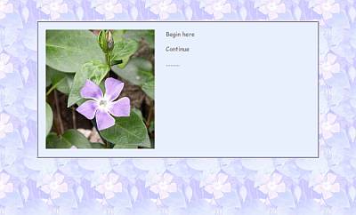
Then, by altering a couple of things, we changed it to this.
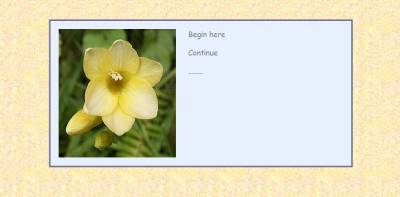
or something similar.
That very pale blue writing area looks stark against yellow, and the border doesn't seem right, either.
How about the text? Does grey go well, or might brown or dark green be better? Might you prefer a different font?
Let's look at the styles.
<style type="text/css">
<!--
body {margin-top:3em;
font-family:"comic sans ms", verdana, helvetica, sans-serif;}
.tab1 {padding:20px;
border-width:4px;
border-style:ridge;
border-color:#c5bcf5;
color:gray;
background:#e9f0fd;}
p {margin-top:0em;text-align:left;font-size:14pt;}
.lt {float:left;margin-right:30px;}
-->
</style>
Watching your changes
How to see what you're doing
You'll want to see changes as you make them, so double click the html file to have it open in your browser—in this case, Internet Explorer is best, because Outlook Express is part of IE and they understand each other. (If you have any paths in a piece of stationery, other browsers just won't display it for you properly—but we're not using paths in this stationery.)
You'll also need to have the file open in Notepad at the same time. You'll probably manage this by right clicking and choosing Edit, or by using Send To > Notepad if you have Notepad on your Send To menu.
Each time you make a change in Notepad and save it, switch to IE and hit the Refresh button—or tap F5 on your keyboard.
Don't be afraid to make changes. The more you change things and see the results, the more familiar you'll become with all the different effects you can achieve.
Take care while changing things.
The styles have lots of punctuation—colons and semi-colons, little dots and some curly brackets. Be very careful not to remove any of them accidentally.
Changing styles line by line
The top margin probably doesn't need to be changed, although you could make it 2em for less top space or 4em for more. As a measurement "em" means "the size of an em dash —"
The next line suggests fonts. The rules are: (1.) put the one you really want at the beginning of a little list, but always finish the list with either serif or sans-serif in case the recipient has none of the fonts you name; and, (2.) if the name of the font has two or more words, put quotes around that name. So you might write
Georgia, "Book Antiqua", "Times New Roman", serif
The writing area
Now, .tab1, which is a one-celled table forming a plain area for your typing. top
Padding
"Padding" makes a space between the edge of the table and whatever is inside, so that pictures and text don't touch the border. You can make that narrower if you like: anything down to about 5px.
Borders
Borders have color, width and style.
Border width also can be whatever you like. If you want to get rid of the border, change the width to 0px.
Border styles
Border styles include solid, double, dotted, dashed, inset, outset, groove and ridge. Colours appear different with different border styles and widths, as you'll notice with some of these swatches.
![10px_double_ffffcc.gif 10px_double_ffffcc.gif [100*100] [5008bytes]](periwinkle/10px_double_ffffcc.gif)
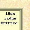
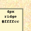
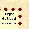
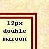
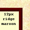
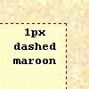
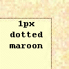
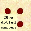
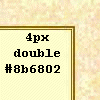
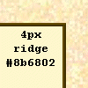
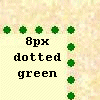
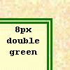
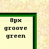
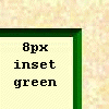
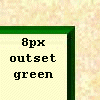
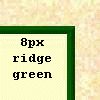
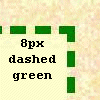
(#ffffcc is a very pale yellow like this page and #8b6802 is a medium brown)
Colour and background
"Color" means text colour
so this part means grey text on an off-white background. In the styles, as well as in html, American spelling is compulsory, so "gray". top
color:gray;
background:#e9f0fd;
Some colours can be written as is. They are aqua, black, blue, fuchsia, gray, green, lime, maroon, navy, olive, purple, red, silver, teal, white and yellow. For more subtle colours, you'll need to use some sort help. I find Color Cop very simple and easy to use. Considering the picture we've used, green would probably be good for this stationery. A fairly dark green is #006600. An even darker green is #003300.
Background
Background is the colour behind the text. Without styled stationery, background would be the all-over background colour. In this instance, it's the colour of the writing area.
Always try to have a strong contrast between the text colour and the background colour; the most important thing about an email, on stationery or not, is that it can be easily read.
I felt that with the small yellow tile this combination looked rather nice.
border-width:4px;
border-style:ridge;
border-color:#ffffcc;
color:gray;
background:#ffffcc;
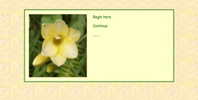
My freesia stationery now looks like this.
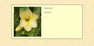
Mm. Or maybe I prefer this. top
border-width:4px;
border-style:double;
border-color:#006600;
color:#006600;
background:#ffffcc;

Size of text—Paragraphs
This line describes a paragraph. In html for the web, you wouldn't give a font size in points, but in OE/WM stationery, that's the way it's done.
p {margin-top:0em;text-align:left;font-size:14pt;}
Arranging pictures
.lt {float:left;margin-right:30px;}
This is a special arrangement for a picture. It says to move the picture to the left and to allow text to flow to the right of it. There's no need for a margin on the left, since the padding makes a space. The margin on the right is needed, though, so that writing doesn't bump right up against the picture.
If I wanted a picture to be on the right of the text area, I'd write this instead. top
.lt {float:right;margin-left:30px;}
You could change the 30px margin if you wanted to make the space between picture and text a bit less. Anything under 10px would probably be too narrow.
Centring a picture
If your picture is nearly as wide as the writing area, you'll almost certainly want to centre it. If you want to centre a picture, you'd go to this part of the email.
<img src="periwinkle0598b.jpg" width="288" height="315"
class="lt" alt="periwinkle flower">
I'd remove the bit that says class="lt" and then put center tags around the whole image tag, like this.
<center><img src="periwinkle0598b.jpg" width="288" height="315"
 alt="periwinkle flower"></center>
Have fun!
Saving the original stationery
This page gives you a sample to save and assemble.
Changing pictures and background
There are tips here to help you change the picture and the background.
Questions or comments? I’d love to hear from you. My email address is here.
Return to top
Drop-Down Menu from Brothercake
Everything below this is a javascript menu. If you are using a reader,
please use the links here.