This page is for easy printing. Here’s the full version with step-by-step illustrations.
Once you have the hang of it, making seamless background tiles is easy. All you have to do is turn your tile inside out; that is, put the inside on the outside. Sound wierd? Read on.
Some people have had trouble with the msi installation file. The author does explain how to deal with this, but you may find it better to download the zip file, which the second one shown beside the Download heading.
Paint is where you actually design a new picture for your tile.
sTile will quickly show how the tiles look as a background and you can then use it to change their appearance dramatically. There’s not nearly enough fuss about sTile. It’s crammed with special effects, short step-by-step lessons, suggestions and instructions for making interesting text, on and on. We’re just lightly touching it.
If you’re unsure about using Paint, tools and techniques are explained at http://fay.iniminimo.com/paint.html.
To begin, have Paint, sTile and Irfan easy to access. Do this by temporarily putting a shortcut to each on your desktop.
Open Paint and drag the bottom right-hand corner until you have a work area of about 400 by 400 pixels.
If you'd prefer, you can set the bitmap size by clicking Image in the menu bar, choosing Attributes, and setting the bitmap size in the Attributes box.
Save the empty workspace as a 16 colour bitmap. You might call it “workspace.bmp”. As you work through the exercise, save frequently, particularly before each major change.
Don't be alarmed by the colours used in the beginning of this exercise. Your finished colours, which will be of your choice, will be completely different.
1. In the drawing window, choose a light colour, but one that you can see clearly against the white workspace. Aqua works well for me.
2. Click on the rectangle symbol in the toolbox. ![]()
3.Three symbols will appear below the toolbox. The first indicates a hollow rectangle. The second indicates a filled rectangle with a border. Choose the third option, which stands for a solid rectangle with no border.
4. In the middle of the workspace, draw a square. Make it somewhere between 100 and 200 pixels on a side.
Holding the shift key while you drag forces the shape to be a square.
Numbers indicating the size of the square will appear at the right-hand end of the status bar.
The smaller the square the less disk space it will take. The larger the square the easier it will be to work with. Through most of this exercise I’ll be working with a tile 183 pixels square.
At the end we’ll reduce a finished tile to 100 by 100.
5. Now choose one strong, contrasting colour and decorate the square in any way that you like. I’ve used symbols from a decorative font. Differently sized squares and circles will work well, too. The only rule you need to observe is to stay away from the edges.
When you're satisfied, go on to the next step. Remember that this is only practice and don't try for anything wonderful the first time.
We’re going to turn the tile inside-out.
6. Click on the rectangular selection tool. It’s a dashed rectangle at the top of the toolbox. ![]()
7. Click the transparent option below the toolbox. It's the lower of the two. Make sure, also, that your right button colour is set to white.
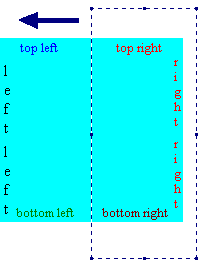
 8. Make sure that there’s plenty of white space to the left of your square. If there isn’t, select the whole square and drag it towards the right.
Then select the right half of your square. Don't worry about being precise. Approximately half is fine.
9. Drag the selected piece across the left half to the white space on the other side. Make it join the left edge. Watch to see that the tops of the two pieces are lined up properly. Be careful not to overlap the edges, but also be sure that no white is showing between the two pieces.
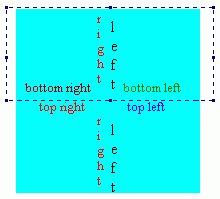
10. Make sure that there's plenty of white space above your square. If there isn’t, select the whole square and drag it down to make room.
Then select the bottom half of the square. Again, precision isn’t necessary.
11. Drag the bottom piece up above the top piece, line it up carefully and join it to the top piece.
The inside of the tile has now become the outside. The decoration has moved to the corners and sides. Were you to lay several copies of the tile edge to edge, you’d find that the edges match exactly.
If you are making a background from an existing picture, go to http://fay.iniminimo.com/seamless_flower.html.
12. Now, again using the same strong colour, decorate the empty centre of the tile, very carefully avoiding all edges. Just adding one or two shapes to the centre should be enough for this practice.
At this point the actual method of decoration isn’t being stressed. You can probably tell that I've just used a few characters from a symbol font. There are lots of these available, some free and many that come with programs. Corel Draw has lots. This one is Botanical and it came with Lotus Smart Suite.
Searching for free fonts on the web is a bit hairy—most links lead to sales sites. When I do find a good link I’ll put it up. Meanwhile, if you want to have a better idea of what’s included in the symbol fonts you already have, there’s a zipped up document that can help at http://fay.iniminimo.com/zips/fontchart.zip. It’s in rtf so that it’ll work with as many word processors as possible, although the instructions included are for MS Word and you may have to adapt them for other programs. Please, as with all downloaded things, do virus check the zip before running it. It was fine when it left here, though.
The next bit can take some patience. You’re going to select the tile, copy it and paste it into a different program to check that it’s been cut out precisely. This is the only difficult part of the whole project. It can take several attempts, so do persevere.
1. Using the rectangular selection tool, outline the tile. You’ll find it easier if you click the little magnifying glass in the toolbox and click it over the tile. Make sure that all of the tile is showing in the window; Paint does not scroll while you’re selecting.
Put the crosshair cursor exactly on the top left hand corner of the tile. One line of the cross should be in the top line of colour, one should be in the leftmost line. Colour should show through the little eye of the crosshair. Drag to the bottom right corner.
As you drag, a heavy dotted outline will appear and you can easily see whether or not this is exactly on the outside edge of the tile. When the dotted outline is exactly on the outside of the tile all the way around, click on Edit on the Paint menu bar. Click Copy on the menu that appears.
2. Minimise the Paint window by clicking the in the top right corner. Double click the icon for sTile. When the program opens, click on the Edit menu, then on Paste and choose Replace Image. The main window will fill with your tile image.
3. At the right hand end of the sTile toolbar you’ll see this icon. Click it once and you’ll be given a preview of your tile as a background. Remember, though, that colour is not yet a concern. You’re looking only to see whether the tiles join correctly. If there are any white lines showing, the tile needs to be copied again.
If there are white lines showing, maximise the Paint window by clicking its button on the taskbar and try again. Absolutely everybody has trouble with accurate cutting out at first, so don’t be dismayed.
4. When sTile shows you a perfectly matched background, click OK to come out of the tile display window, click File > Save As on the sTile menu bar and save your tile as tile01.jpg. Because the final textured effect depends on fine gradations of colour this is the better format for this project.
You can now exit from Paint. Whether or not you save changes in answer to the prompt doesn't matter. Next time that you use “workspace.bmp” you’ll probably begin by covering all existing work with a white rectangle anyway.
This next part is easy and fun and you’ll finish up with as many variations of your tile as you choose to make.
1. Still in sTile, and with your tile in the window, go File > Save As and make a back-up—tile02.gif. That means you can always go back to your original if you don’t like some of the changes.
2. On the menu bar, click Effects. Slide down to Filters. Click on “Classic Emboss”. Your tile will lose most of its colour. Save it as tile03.jpg.
You can further flatten the colours by clicking Effects, sliding onto Color and clicking on Gray Scale. Save the resultant image as tile04.jpg. The busy effect in the last of the sample tiles would be much less likely with a grey scale image.
From here you can really branch out and try things. Load any one of the saved tiles and start probing sTile’s Effects menus.
When you click any of the items in Colour, a click on the three crayons icon will pop down sliders with which you can increase or decrease the proportion of a particular colour, increase or decrease the contrast, lighten or darken the whole picture or increase the colour saturation.
To the left of the window is the useful “Effects Tree”. Because it doesn’t slip and slide like menus, you can work your way through it item by item, looking at each set of effects and trying those you fancy.
Reduce the size of any tile that you'd like to keep and use. With the tile open in the sTile window, click on Size/Aspect in the Effects Tree at the left. (If you prefer, click Effects > Size/Aspect on the menu bar.) Choose ReSize Smooth from the next branch or menu. With a check mark in Pixels, change the number in both the width box and the height box to 100. Click OK, then click File > Save As and save this smaller tile as tile_small01.jpg.
These directions with full illustrations are at http://fay.iniminimo.com/seamless.html.